 This CHOCOLATE looks good.
I've put together a Picasa page about my trip through CHOCOLATE. You can find it here.
 This CHOCOLATE looks good.
 They have to go. They may have been good letters, they may have been interesting, but they just didn't continue the vibe I had going on with the rest of the words, so they are "out."
 All the letters I made for CHOCOLATE have to be re-done. Every. Single. Letter.
 Making these really wonky letters for CHOCOLATE is really tricky. I like the second "O" better this time around. Looking at the photo, I need to spread the letters apart more. They are too tightly packed. Good thing they aren't sewn down.
 I liked some elements of this Showcard Gothic font (above). I liked that the letters were wider at the top than at the bottom. So I played with that a bit, (you will have to click the photo to enlarge, then click it again to see my drawings), but the letters looked like teeth, and that didn't remind me much of chocolate. Then I tried alternating the letters, but they just looked too blocky.
 As I looked at the color words I had already sewn, I realized I did not have a word where I mixed up sentence case or the size of letters. I thought that might be a good thing to play with. So I played around a bit more, exaggerating angles and bumping the letters out of their horizontal boundaries a bit. I like this a lot, and it adds a bit of fun to the word.
  Here are the first two letters. Yes, that's a piano and a double bass in the "H". Both say JAZZ, which while not necessarily chocolate, definitely say smooth to me. But don't worry, I'm definitely gonna get those chocolate novelty fabrics in there!
 My son doesn't like my interpretation of this "O", which uses a white chocolate as the center of the "O". He doesn't think it "reads" like an "O" because the chocolate directly above the center has that white swirl. I agree the letter doesn't quite work, but I think it's because it is too big. I'm going to keep tinkering.
 Karen S:
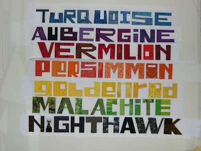
 My son studied the word, which was on the wall with all the others.
 "Does the word champagne really have to have curves?"
 Well, here's CHAMPAGNE. (You can/should click the image to enlarge, and then click again for more detail.) I love all the letters that don't have curves.
 Here are a few more.... (sorry for the lousy photos, there's not a lot of light)
 I've got some ideas to relieve beige-boredom, and you can see one of them here, in this attempt at a "C" in a Broadway-style font.
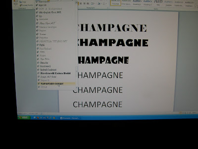
 Rather than reinvent the wheel, I decided to see what the word looked like in different fonts, and the easiest way to do that was just to open my word processing program on my computer and try some.
 In this one, notice the really thin font (Papyrus. You can click the photos to enlarge, and then click again for more detail). Notice how the crossbar for the H is very high, but for the A it is very low. The loop on the P is tiny, and high up, and the cross bar on the E is high up too. Those help the letters feel light.
 In this last one, check out the triangle shape used as the crossbar in the letter A (in Showcard Gothic). That has potential!

 Not quite sure how I will arrange the words. I shouldn't even be worrying yet as I still have two more words to make. I want the very last word to be CHOCOLATE because I think it will be a fun surprise when you get to the end.
 It is one of the letters I like the most. I make two V's and then set them side by side. Much trickery and some geometry is involved.
 Then I set my rule on top and determine how to trim it. I also use strips of fabric to isolate the letter, but I have removed them in the photo.
 W, all ready to join the others.
 I had been stuck on what "style" letters to do with this word (and the white and brown), but my friend Julie set me straight. She told me to quit stressing, and said "mix it up" and "utilize the power of your fabrics."
 She was right. (you can click the pictures to enlarge)
 I am particularly proud of the "K."
 Astrid wanted creams and colors. She isn't a fan of pink, and preferred strong colors over pastels. She liked the Sunshine Quilt I made for my son, so this is the same Slashed Squares design. The quilt is about 70" square.
 This is a quilt I am making for my friend Astrid. I got it all bound last night, and will try to take some pictures of the quilt in natural light today, and then I'll send the quilt to her. She's quite looking forward to it, as it was 37F (3C) at her house yesterday morning!
 Yesterday I was trying to figure out if I -really- needed to add White, Black and Brown. Thinking about how yesterday was 10-10-10 made me think about how my color words had nine letters each, and if I used nine words, the quilt would be Nine by Nine, or Nine Squared.
 Top Chef Just Desserts (glad HE went home, was disappointed in HER);
 Project Runway (can I tell you how much I dislike Gretchen?)
 and Hawaii Five-O (this is shaping up to be my guilty pleasure.)
 For me, the best stress relief is spending time in the sewing studio. Here are the letters for GOLDENROD. I haven't trimmed them down, or sewn them together yet.