 Finally I know exactly how to get precisely the effect I was after. Oh boy, I am really going to have some fun with this technique.
Thursday, March 31, 2011
Woo Hoo!
Now THIS is the effect I was looking for!  Finally I know exactly how to get precisely the effect I was after. Oh boy, I am really going to have some fun with this technique.
Finally I know exactly how to get precisely the effect I was after. Oh boy, I am really going to have some fun with this technique.
Wednesday, March 30, 2011
Wordless Wednesday


The space between the U and the N probably needs to be bigger, and the exclamation mark may need to move up a bit.
I found a good quote in Luana Rubin's weekly email blast this week. She wrote: "Breaking the rules = Creativity!"
Tuesday, March 29, 2011
Wide Fun
This wide, white FUN is just to the right of the ALL THE in my white rules quilt. I love having elements in this quilt that viewers can discover for themselves if they take the time to look. I've decided I'm not telling anybody they're in there. It's going to be very interesting to see the reactions. I hope this works!
The letters are about 2" tall and 7" wide.
 It's going to be very interesting to see the reactions. I hope this works!
The letters are about 2" tall and 7" wide.
Sunday, March 27, 2011
A Matter of Viewpoint
My son came over yesterday and looked and the white crumbs I had added to the white rules quilt.  He wasn't sure. "I dunno, Mom. Everything else is so clean and precise. I just don't think those bits work."
Come over here, I told him, and look at it this way. I was standing off to the side.
He came to stand next to me.
"OH!"
You can click the photo to enlarge, and then click it again for more detail.
 He wasn't sure. "I dunno, Mom. Everything else is so clean and precise. I just don't think those bits work."
Come over here, I told him, and look at it this way. I was standing off to the side.
He came to stand next to me.
"OH!"
You can click the photo to enlarge, and then click it again for more detail.
Friday, March 25, 2011
Do Not Adjust Your Television...
If you're old enough, you'll remember that phrase from an old TV show, The Twilight Zone. (I think?)
 Anyway, there IS something in the photo, and I'm not telling you what it is. You can click the photo to enlarge, and you can click it again if you need it bigger. In real life, this block is about 3-1/2" tall by about 10" wide (9 cm x 25 cm).
Enjoy!
 Anyway, there IS something in the photo, and I'm not telling you what it is. You can click the photo to enlarge, and you can click it again if you need it bigger. In real life, this block is about 3-1/2" tall by about 10" wide (9 cm x 25 cm).
Enjoy!
Thursday, March 24, 2011
Getting Crumbly
I've decided to fill up some of the white space on my rules quilt with WOW crumbs. I got the idea from Julie's use of yellows on Magic Happens. Since I keep all my extra WOW strips in a plastic bin, this is a pretty easy task.
 As you can see, these make a lovely design. I always use as many WOWs as I can get my hands on when I make my quilts with white backgrounds.
 I love the way the light reflects differently on them, and makes for an interesting and lively surface.
 As you can see, these make a lovely design. I always use as many WOWs as I can get my hands on when I make my quilts with white backgrounds.
 I love the way the light reflects differently on them, and makes for an interesting and lively surface.
Wednesday, March 23, 2011
A Little Fun
The letters in this FUN are about 3-1/2" tall and the word is only about 7" wide. I haven't decided where it's going to go yet (or even if I'll use it). This is an example of why it's important to keep your scraps. I had two pieces of this fingerprint-y batik fabric - one about one inch wide by about 22" long, the other, about 1-1/4" wide and about 18" long. I bought it (and used most of it for another quilt) three years ago.
 This is an example of why it's important to keep your scraps. I had two pieces of this fingerprint-y batik fabric - one about one inch wide by about 22" long, the other, about 1-1/4" wide and about 18" long. I bought it (and used most of it for another quilt) three years ago.
Tuesday, March 22, 2011

Monday, March 21, 2011
My Rules
I was really worn out from the marathon sewing session with my sister on Saturday, so I didn't get much done yesterday.  I moved the letters over to the design wall in the dining room. The word spacing needs a tiny bit of fine tuning, but overall I am happy with it.
I also worked up an exclamation point for my rules quilt. As for the exclamation mark... I had to add more cats!
I'm not quite sure about the "dot," though.
 I moved the letters over to the design wall in the dining room. The word spacing needs a tiny bit of fine tuning, but overall I am happy with it.
I also worked up an exclamation point for my rules quilt.
 As for the exclamation mark... I had to add more cats!
I'm not quite sure about the "dot," though.
Sunday, March 20, 2011
Sister Love
I love my sister. I really do. She doesn't like the same fabrics as I do, she doesn't like the same clothes as I do, she doesn't like a lot of foods I do. She good at things I'm not, and she's allergic to cats.
No matter, we have great fun together. When I told a dear friend of mine (who lives 3,000 miles away) that my sister and I could have fun in a paper bag, she replied, "From what I've heard about you and your sister, you don't even need the bag."
So when my sister called me Friday evening and asked if I could help her with a small lap quilt she was finishing up, I said, "Sure, no problem." Sister ties her quilts, then folds the back over to the front and machine sews it down. Piece of cake, I thought, couple of hours, I'll be home for dinner and can work on my white rules quilt.
I got to her house Saturday afternoon. "I don't have the back put together yet," she says to me.
"Okay."
"I mean, I didn't make the letters yet."
"What letters?"
"It has to say from Karen with love Malissa."
I counted the letters on my fingers. "THAT'S TWENTY-FOUR LETTERS. You have to make 24 letters, THEN add them to the backing, THEN finish the quilt????"
"Yeah."
"Do you know how long it's going to take to make 24 letters?"
"No, but you're the expert in letters." Then she added, "and they have to look like I made them."
About this time I'm thinking, "Damn honey, are YOU lucky I love you, because this is gonna take ALL DAY and I would much rather be home working on my own quilt."
Instead I said, "ok, what do you want the letters to look like, and how big do you want them to be?"
We got to work. We worked all afternoon, cutting strips, sewing letters. We had dinner, and worked into the evening. (We did take a side trip to the lqs for more fabric.)
After seven hours I said I had to go. My hands hurt, my arms hurt, my legs hurt, my back hurt. We got all the words done.
I love my sister.
Really.
You can see the words here.
Saturday, March 19, 2011
Bigger!
My son was visiting last night, and we were sitting at the dinner table eating when suddenly he dropped his fork.
"MOM! I -love- what you're doing with that quilt. I think a giant FUN will be just perfect."
I had to turn around to see what he was looking at. "Honey, that's nothing. I just put that piece of pink fabric there because Sweetbean told me FUN should be pink."
 We went into the sewing studio after dinner to talk about it. "Mom, look at the way you have the letters arranged. THE RULES are blocky, and they are the shortest words in the quilt. The words get bigger and bigger as you move away from them, both above and below. The YOU MISS gets a bit bigger, then ALL THE gets bigger still. I want THE FUN to take up one-third of the quilt."
I looked at him, not quite sure if I really wanted to make the word FUN sixteen inches tall.
He had a broad grin on his face. "Say it Mom," he teased. "Say it."
This is the kid with the terrific "eye." He had told me he didn't like the cursive F, or the multi colored ALL THEs. His design advice is always on target.
"Say it Mom, you know it, now say it." I kept looking back and forth from the design wall to his shining face. He was right, he knew it, and he wanted me to admit it.
I said it.
"You're right. FUN has to be bigger."
"A lot bigger."
"Ok, a lot bigger."
"REALLY BIGGER," he said, gesturing with his hands, a broad grin on his face.
"REALLY BIGGER, ok!" I gave him a hug. He left for his Karate class (I swear his feet never touched the ground) and I got to work.
Hours later, I knew the kid was absolutely 100% right. The word FUN -did- need to be BIG!
 These letters may be too thick, and they won't necessarily be lined up so neatly, but those are easy fixes, and it was approaching midnight.
Woo hoo! Gosh, I love that kid!
"MOM! I -love- what you're doing with that quilt. I think a giant FUN will be just perfect."
I had to turn around to see what he was looking at.
 "Honey, that's nothing. I just put that piece of pink fabric there because Sweetbean told me FUN should be pink."
 We went into the sewing studio after dinner to talk about it. "Mom, look at the way you have the letters arranged. THE RULES are blocky, and they are the shortest words in the quilt. The words get bigger and bigger as you move away from them, both above and below. The YOU MISS gets a bit bigger, then ALL THE gets bigger still. I want THE FUN to take up one-third of the quilt."
I looked at him, not quite sure if I really wanted to make the word FUN sixteen inches tall.
He had a broad grin on his face. "Say it Mom," he teased. "Say it."
This is the kid with the terrific "eye." He had told me he didn't like the cursive F, or the multi colored ALL THEs. His design advice is always on target.
"Say it Mom, you know it, now say it." I kept looking back and forth from the design wall to his shining face. He was right, he knew it, and he wanted me to admit it.
I said it.
"You're right. FUN has to be bigger."
"A lot bigger."
"Ok, a lot bigger."
"REALLY BIGGER," he said, gesturing with his hands, a broad grin on his face.
"REALLY BIGGER, ok!" I gave him a hug. He left for his Karate class (I swear his feet never touched the ground) and I got to work.
Hours later, I knew the kid was absolutely 100% right. The word FUN -did- need to be BIG!
 These letters may be too thick, and they won't necessarily be lined up so neatly, but those are easy fixes, and it was approaching midnight.
Woo hoo! Gosh, I love that kid!
Friday, March 18, 2011
Magic Happens
 Magic Happens is here! These are my friends, Daniela and Maryann, holding the quilt up. They both loved it.
 Everybody loves the back - it's all black and white fabrics. How perfect!
 The quilt was a real show-stopper as it hung on the dividing wall on my "office." Even the guys stopped by to comment and ask questions. ("Who are Julie and Chris?")
 Chris quilted it in a variegated black-and-white thread. It makes me think of my tuxedo cat, Millie! I love it!
 Can you tell?
Julie, Chris, our collaboration has been fabulous! Thank you both so much!
Thursday, March 17, 2011
Can You See It?
Here they are...all three Rules quilts. You should be able to see what is consistent about them.


 Look, in particular, at the word "Fun" in each of these three quilts. Compare the word "FUN" to the other letters.
Not too much difference, is there? The "font" is the same, just the use of fabric, and the placement of the letters distinguish "FUN" from the other words. One of the things that makes these quilts work (for me) is the particular use of the font, the rhythm of the letters and their negative spaces. You see that most in Helen's quilt (the yellow and red-orange one), and it shows up strongly because of the limited selection of colors.
We keep hearing that we have to think "outside the box," but really, the answer to my problem was to get back into it. I had to go back to remember my original plan for this quilt. In my efforts to make this quilt different from the first three Rules quilts (which are each over a thousand miles away from me), I think I got derailed from my original idea.

The word FUN on my White Rules quilt will follow the lead of the first three, but I do not consider my failed efforts a waste of time or fabric. I think we learn more from our failures than we do our successes, and if we never experiment, our work gets stale and boring.
Wednesday, March 16, 2011
Getting closer to FUN
OK. Don't worry about the color. Don't look at the fabric. Don't look at the way the letters are lined up. Don't look at the out-of-size "u." Don't look at the scale of the red "Fun" compared to the other letters.
 Ignore, even, the attempt at a drop shadow around the "N." (The idea is good; the execution - not so much.) The fabrics here were from my "fugly" collection. This word is a mock-up.
Just look at the letters. I'm playing with the shape of them. I've left this photo enormous, so you can click and then click again for lots of detail.
I already know the answer, and I'll tell you in my next post. The answer may surprise you.
Tuesday, March 15, 2011
Green
Regular readers know I have a "thing" for eyeglasses. Some ladies like shoes, some like bags, some like scarves or bracelets. For me it's eyeglasses.  I had some money left over from my FSA and I had to spend it. Ergo, new computer glasses.
 Don't tell me about the places to get cheap frames. I think they are homely. I like the hot new stylish ones. I'm a snob, what can I say?
These look great on me and I love them.
There is something very interesting going on with the Rules Quilt... You'll all have to stay tuned. As for yesterday's post, I was trying to do a color wash in the words "all the" by using not only several fabrics for each letter, but more than one color as well.
 I had some money left over from my FSA and I had to spend it. Ergo, new computer glasses.
 Don't tell me about the places to get cheap frames. I think they are homely. I like the hot new stylish ones. I'm a snob, what can I say?
These look great on me and I love them.
There is something very interesting going on with the Rules Quilt... You'll all have to stay tuned. As for yesterday's post, I was trying to do a color wash in the words "all the" by using not only several fabrics for each letter, but more than one color as well.
Monday, March 14, 2011
Planning
Have you ever heard the phrase, "If you don't know where you're going, you will end up someplace else." I like knowing where I am going, so I plan. I need to know what my letters are supposed to look like, so I often draw them out first.
 And I like to know what colors will work, so I play with those too.
 Here is the Rules quilt so far. The "E" in "the" is too tall, so that's going to change, but I am loving it so far.
Props to the commenter who figures out what I am doing in the "all the". You can click the photos, and then click again to enlarge.
 I like knowing where I am going, so I plan. I need to know what my letters are supposed to look like, so I often draw them out first.
 And I like to know what colors will work, so I play with those too.
 Here is the Rules quilt so far. The "E" in "the" is too tall, so that's going to change, but I am loving it so far.
Props to the commenter who figures out what I am doing in the "all the". You can click the photos, and then click again to enlarge.
Sunday, March 13, 2011
A New You

Saturday, March 12, 2011
The Wrong Road
There's a Turkish proverb:
I've been struggling with the Rules quilt for several weeks. Your comments, and my friend Julie helped me identify why it was bothering me.
I wanted to make myself a Rules quilt because I loved the lovely rhythm of the shapes of the letters and the negative spaces between them.
The quilt was going according to plan until I got past "you miss." After that, when the letters -should- have been getting wonkier and looser - breaking the rules - instead they got more alike. I had made "all the" with the same fabric!
Then, I made a lovely, calligraphic "F." It was gorgeous, but it didn't really have enough visual weight. It looked too flimsy, and the quilt looked disjointed, like it was two separate quilts. Also, the upper case cursive F -required- lower case cursive letters to form the rest of the word. It would have been too formal, too precise. Not part of the spirit of the phrase "If you obey all the rules you miss all the fun."
I've made enough art to know that how the piece works as a whole is the most important thing to consider. If there is one element that distracts from that whole, it has to be modified, and may need to be removed.
So the striped "all the"... gone.
The lovely cursive "F," that's gone too.
I believe I have turned back from the wrong road, and am now on the right one.
(and yes, that Turkish proverb is on the short list of word quilts I want to make.)
No matter how far you've gone down the wrong road, turn back.
I've been struggling with the Rules quilt for several weeks. Your comments, and my friend Julie helped me identify why it was bothering me.
I wanted to make myself a Rules quilt because I loved the lovely rhythm of the shapes of the letters and the negative spaces between them.
The quilt was going according to plan until I got past "you miss." After that, when the letters -should- have been getting wonkier and looser - breaking the rules - instead they got more alike. I had made "all the" with the same fabric!
Then, I made a lovely, calligraphic "F." It was gorgeous, but it didn't really have enough visual weight. It looked too flimsy, and the quilt looked disjointed, like it was two separate quilts. Also, the upper case cursive F -required- lower case cursive letters to form the rest of the word. It would have been too formal, too precise. Not part of the spirit of the phrase "If you obey all the rules you miss all the fun."
I've made enough art to know that how the piece works as a whole is the most important thing to consider. If there is one element that distracts from that whole, it has to be modified, and may need to be removed.
So the striped "all the"... gone.
The lovely cursive "F," that's gone too.
I believe I have turned back from the wrong road, and am now on the right one.
(and yes, that Turkish proverb is on the short list of word quilts I want to make.)
Thursday, March 10, 2011
Hidden Potential is Here!
Woo hoo! It's here! It's awesome!  It's so much fun to look at, and find every element.
 I love it!
 Love, love love!
You can see all the in process pictures at Julie's Picasa album here, and then follow the quilting journey over at Chris's Picasa album here.
 It's so much fun to look at, and find every element.
 I love it!
 Love, love love!
You can see all the in process pictures at Julie's Picasa album here, and then follow the quilting journey over at Chris's Picasa album here.
Tuesday, March 8, 2011
UN
I've been really tired lately, so last night I just sat on the couch (with Millie purring nearby), watching tv (The Making of the Universe: Black Holes, then The Big Bang), with my sketchbook in hand. I worked on the UN in FUN. Here's what I ended up with: and then I flipped it upside down..
 and for what it's worth, I like layout # 2 best in Sunday's post also.
 and then I flipped it upside down..
 and for what it's worth, I like layout # 2 best in Sunday's post also.
Sunday, March 6, 2011
Eeny Meeny Miney Moe...
I'm stuck.
1. I had originally envisioned the striped "all the" in an arc above the word "Fun." Since that would require the other letters to be centered, it might look like this:

2. Then I thought to left-justify the letters like this, slide the FUN over to the right, and use the "all the" in an arc filling up a bit of the space on the left.
3. Then I thought, hmm.. maybe the striped "all the" letters are too thin, and don't really carry on the theme of the other letters.. maybe I should make them more like the others and line them up too (and then "FUN" slides over to the right to balance the composition).
4. But what if I insert an asterisk between "all" and "the" and then center the word "FUN" under that...
5. Here I have gone back to the original skinny "all the" and positioned them in an arc again over "FUN" but kept the asterisk in between. It doesn't help that I'm not completely in love with this "u."

So here's the thing. There are LOTS of good possibilities, and several conundrums.
a. I want the quilt to be one unit, not two sets of disparate elements competing against each other. I am worried that the striped letters "all the" break the "rules" thought a bit too soon.
b. so I don't know if I should replace the striped "all the" with more regularly shaped letters (as in the ones above) or use the skinny ones, or the more "regular" set.
c. I don't know if I should make the "UN" in fun more curvy or make them straight. (This is a time where I really need to make both types and try them out to see.)
d. Much as I absolutely adore the curve-y "F" I don't know if it fits, and I can't answer that until I resolve the issue in my own head, because I can't make it do what I want if I don't know what I want.
Oscar Wilde once said, "The anxiety is unbearable. I only hope it lasts forever."
Your thoughts, positive, negative, whatever... are all welcome, and may help me get un-stuck.
thanks,
Lynne
1. I had originally envisioned the striped "all the" in an arc above the word "Fun." Since that would require the other letters to be centered, it might look like this:

2. Then I thought to left-justify the letters like this, slide the FUN over to the right, and use the "all the" in an arc filling up a bit of the space on the left.

3. Then I thought, hmm.. maybe the striped "all the" letters are too thin, and don't really carry on the theme of the other letters.. maybe I should make them more like the others and line them up too (and then "FUN" slides over to the right to balance the composition).

4. But what if I insert an asterisk between "all" and "the" and then center the word "FUN" under that...

5. Here I have gone back to the original skinny "all the" and positioned them in an arc again over "FUN" but kept the asterisk in between.
 It doesn't help that I'm not completely in love with this "u."
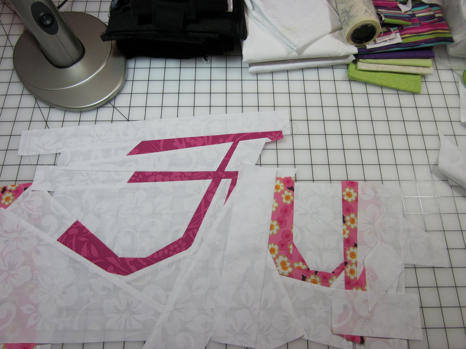
So here's the thing. There are LOTS of good possibilities, and several conundrums.
a. I want the quilt to be one unit, not two sets of disparate elements competing against each other. I am worried that the striped letters "all the" break the "rules" thought a bit too soon.
b. so I don't know if I should replace the striped "all the" with more regularly shaped letters (as in the ones above) or use the skinny ones, or the more "regular" set.
c. I don't know if I should make the "UN" in fun more curvy or make them straight. (This is a time where I really need to make both types and try them out to see.)
d. Much as I absolutely adore the curve-y "F" I don't know if it fits, and I can't answer that until I resolve the issue in my own head, because I can't make it do what I want if I don't know what I want.
Oscar Wilde once said, "The anxiety is unbearable. I only hope it lasts forever."
Your thoughts, positive, negative, whatever... are all welcome, and may help me get un-stuck.
thanks,
Lynne
Saturday, March 5, 2011
White Rules - Update
I've sewn the letters into words, but I haven't sewn words together yet.  Here's what I am thinking... I like "IF YOU" and there needs to be a bit more space between "OBEY" and "ALL." The space between "the" and "RULES" is okay, but it needs to be a bit lower than the word row above it. I just realized I can't spell "YOU" so that's gonna have to change (gee, that's funny-looking).
I like the spacing of the letters in "MISS" but the lady is too high, she has to move down lower, because I don't like the wide empty space between "the RULES" and "YOU MISS," and obviously I can't chop her head off.
I started sewing the words together because I needed to see how much space these words would occupy, and so I would get a better sense what to with the "all the" and then the "Fun" which come afterward.
Update:
OK, I fixed "YOU" and I lowered the lady just a bit, and I think it is looking good. "the" and "Rules" need a bit more space between them, as do "YOU" and "MISS", but I really think the first two words may need to be centered, like so...
I'm starting to get excited!
 Here's what I am thinking... I like "IF YOU" and there needs to be a bit more space between "OBEY" and "ALL." The space between "the" and "RULES" is okay, but it needs to be a bit lower than the word row above it. I just realized I can't spell "YOU" so that's gonna have to change (gee, that's funny-looking).
I like the spacing of the letters in "MISS" but the lady is too high, she has to move down lower, because I don't like the wide empty space between "the RULES" and "YOU MISS," and obviously I can't chop her head off.
I started sewing the words together because I needed to see how much space these words would occupy, and so I would get a better sense what to with the "all the" and then the "Fun" which come afterward.
Update:
OK, I fixed "YOU" and I lowered the lady just a bit, and I think it is looking good.
 "the" and "Rules" need a bit more space between them, as do "YOU" and "MISS", but I really think the first two words may need to be centered, like so...
I'm starting to get excited!
Friday, March 4, 2011
No More Green
The green mat was useful, but I didn't like working on it. It was dark, and this sewing room (especially in winter) isn't very bright, and seeing the edges of things was hard. And it had a bump in the middle. I tried rotating it, but the bump was still where I wanted to work. So I bit the bullet and ordered a large white cutting mat. It arrived yesterday, and I took it out of the box and let it relax a bit, then laid it out on the table and trimmed it to size.
What a big difference! I love it! Woo hoo!
You HAVE to check out the quilt Julie and Chris and I made, Hidden Potential, at Julie's blog, here. I am positively thrilled!
 So I bit the bullet and ordered a large white cutting mat. It arrived yesterday, and I took it out of the box and let it relax a bit, then laid it out on the table and trimmed it to size.
What a big difference! I love it! Woo hoo!
You HAVE to check out the quilt Julie and Chris and I made, Hidden Potential, at Julie's blog, here. I am positively thrilled!
Wednesday, March 2, 2011
Cat Magnet
 There's nothing like a warm pile of laundry fresh out of the dryer to appeal to a cat. And if it's quilting fabric, so much the better. I washed this terrific pile of fat quarters Chris sent me, but I was too tired/lazy/worn out to iron them. I did wind 11 bobbins with my usual gray thread, so the night wasn't a complete loss!
Tuesday, March 1, 2011
Sneak Peek
 I've been really tired the last few days, so I haven't been sewing or blogging as much. Still, I wanted to give you all an idea of where the white Rules quilt is headed.
I'm not sure I like that candy-cane asterisk. And I'm pretty sure the "u" and "n" in FUN will have to be equally script-like as the "F."
Subscribe to:
Posts (Atom)