Wednesday, July 31, 2013

Rainbow Blues

I'm really busy at work, and rather overtired. Doing something creative usually rejuvenates me, but I just don't have the energy.

(Here I've just flipped one side to see what it looks like.)
 

I want to play with my rainbow blocks but I'm just not feeling the mojo.

Which is really interesting because as soon as I get into bed my brain starts spitting out ideas, and I end up rolling around in bed, not being able to sleep.  There is one idea I haven't put up on the wall yet, and it might be a keeper.  We'll see.

Sunday, July 28, 2013

Rainbow Baby in Daylight


This is the same layout as the one in yesterday's post, but with much better lighting. I will be playing with this more, but I wanted you all to see what it really looked like.

Saturday, July 27, 2013

Chopped!

It has been a week from hell at work, and I've got another week just like it coming up. So Saturday I did whatever I wanted, and what I wanted was to finish cutting the blocks for the Rainbow Baby Quilt.

I just threw some blocks up on the design wall to get an idea of what it might look like.  This is by no means the final design. It is just enough to give me some ideas. I'll definitely be pushing this around.

Stay tuned!

Wednesday, July 24, 2013

Slice and Dice

After a few days of family and workworkwork, I decided that I just had to get into the sewing room and do something. So I got back to slicing the rainbow strips. I've finished cutting up all the yellow, oranges and greens, and I have a big stack of reds, purples and reds left to cut.

So, more later!


PS, Happy (80th) Birthday Ma!

Saturday, July 20, 2013

No Other Otter

This is a greeting card I received in the mail. I smiled as soon as I saw this otter.

And I grinned from ear to ear when I opened it up and read it.

Later, when I talked to Julie she said she saw it months ago and JUST HAD to buy it.  "[The otter] loves eyeglasses just like YOU do!"

Growing up my Mother always said to me, "You're not the average bear." She always meant it affectionately, and it was always a reassurance, because I knew I was not like the other kids.

I can't tell you how much I love this image, and how it makes me smile every time I look at it. I know I am not your average bear, and I'm not like the Otters, either!

Thursday, July 18, 2013

Rainbow Strips

I couldn't leave the pile of strips alone another day, so I sliced up a few of them and threw them up on the design wall. This is kinda sorta what I have in mind. When I cut all the strips I'll be able to experiment a lot more, but it's just too damn hot.

This is approximately 48" tall by about 18" wide.

Monday, July 15, 2013

More Rainbow Strips

I sewed all day yesterday and sewed all the strips together.
.
.
.
I like the way they look.

This is just the first part. Next I get to slice and dice, and move some things around.

Sunday, July 14, 2013

Cutting a Rainbow


One of my co-workers and his wife are expecting their first child in February.  I will make a quilt (duh!)


I am not a fan of pastels (now there's a big surprise) so I pulled these brights.


I've cut all my strips and now will sew them together with a contrasting stripe in the middle of each group.

Saturday, July 13, 2013

Fat Quarter Frenzy

The annual Fat Quarter Frenzy is at Quilted Threads this weekend, so naturally I took Friday afternoon off so I could get there early.
I picked up a lot of "bundles." In this photo, the fabrics in each row were bundled together (except that black and gold in the middle row.)
 This was another big  bundle.
These were the individual FQ's I selected.

In all I bought 62 fat quarters, which is the equivalent of 15-1/2 yards of fabric. Each FQ was $1.45 USD, or a savings of about 52%.

Of course, once I brought these home they had to take a trip through the washing machine and the dryer.
The stray threads had to be trimmed from the edges.

The fabrics had to be ironed.
And folded.


The long drive up to QT provided me a wonderful opportunity to work out my story in my head. I now have a much better beginning, and a tighter storyline.


Thursday, July 11, 2013

Talk, talk, talk

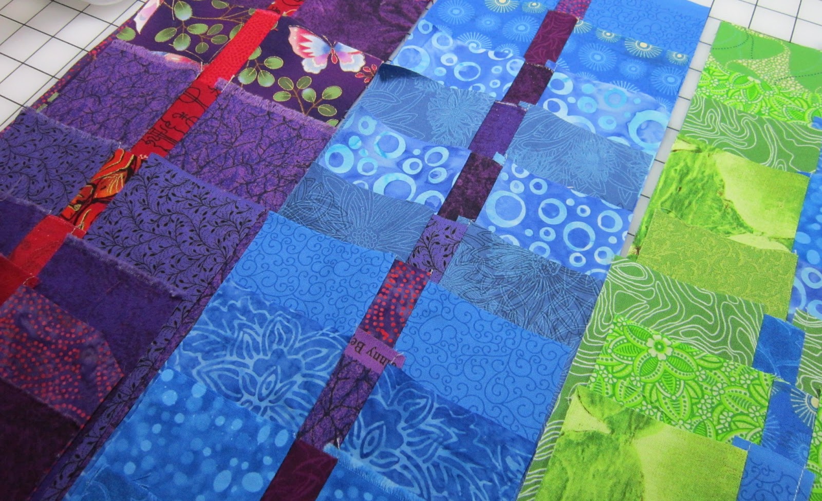
I've been working a lot with words lately. Real words, not free pieced letters. Words on paper. Words in the air.

You see, I've been working on my speech for St Louis in October, and I'm struggling. I have a finite number of minutes to tell my story, and I'm working to fit everything in. That means I have to omit a lot of facts and details. That's no problem, I can do that.

I got the first draft finished last night, and after reading it aloud, I'm well within my time frame, but the speech sounds rushed, which I don't want.

I just wrote the first draft of a book, and now I am telling the same story aloud. What's really interesting is the writing is different for each.

For the book, I can take my time, but I need complete sentences and correct grammar. I need to make sure the reader knows who said what. I have to set a stage and a mood. I have to explain everything without sounding like a news reporter.

For the talk, I can't waste words or time, but I can use sentence fragments. I can use my tone of voice, my gestures, my facial expression and posture, and even silence to make a point. Those things aren't "writing" and yet they are.

When I'm writing to be read, I can tell when it's flowing right along; when I'm "cooking with gas."

When I'm writing to talk, I can't really tell yet.

When I'm telling the story in my head, as I'm driving or doing dishes or taking a shower, I know when I get it right. I just have to remember how I said it so I can write it down later (that rarely happens.)


I know I've got a good story and I know what elements I want to include and what points I want to make. I know the story will connect with the audience on several levels.

Telling the story is different from writing the story. It's another piece of the creative puzzle. I know I'll work it out. I have a lot of experience in creating, and I know how the process works. I've done it enough times that I have faith in my skills and my process, that I will find the right way to tell the story.

It's no different than any other creative activity. You start. You stop. You erase. You start over. You work. You struggle. You worry. You erase. You do something different. You keep working, keep refining, keep editing, keep thinking, keep trying something else, because the ultimate goal is to make this perfect shining thing that stands on it's own and can be instantly understood by whoever takes the time to look, listen, or read it.

Because when they "get it" it's the most magical thing ever.

And damn! I love making art, but when it's good, and you make that emotional connection with your viewer / reader / listener, it's MAGIC!

THAT, my friends, is reason enough to rip it out if it isn't working.


Please excuse me while I wrestle with words and not fabric for a few more days.

Saturday, July 6, 2013

The Shape

Nothing cerebral here today.  I've been playing with my black and white fabrics and letters.
this will be an "O" after a bit of trimming.


As you can see, it won't be a regular "O."

Thursday, July 4, 2013

It's Gestalt

So how come you can see a letter out of this, 

 and this
 but not this?
And how come this one works,
when it doesn't look like it should?

It has nothing to do with color, or value, or contrast, or the distribution of the pattern on the fabric.

It has to do with the way your eye SEES and interprets what it sees. It's Gestalt. We perceive objects such as shapes, letters, pictures, etc., as being whole when they are not complete. When parts of a whole picture are missing, our perception fills in the visual gap. It's called the Law of  Closure.

Your brain interprets the shape first, and even if the edges are missing, it "connects the dots" on its own. Which is why the fourth letter is "readable" and the third one isn't. In the last example, your brain has enough information to complete the shape, to overcome that "lost edge" on the right, and "read" the letter as an "a."

Wednesday, July 3, 2013

Mirage

OK, so you all know I'm diving headlong into what-you-see-isn't-what-you-get. I want to make my viewers WORK, and then I want to tweak their sensibilities a bit, a lot.

(I admit it, I'm nothing more than a blatant manipulator.*)

Herewith, are four whites with varying degrees of black. (these strips are between 2" and 2-1/2" wide.)


Which one of them will make a letter (on a white background) that can be read at a distance? (That's easy.)


The one that will show up MOST is the one on the far right - with the most black.

But which one will disappear? Which one will ALMOST disappear? The answer might surprise you.


The only way to find out is to try. I decided to use this "a" from my "Make It Work" quilt. I didn't want to make a "normal" letter. I wanted to push the boundaries. I made this "a" in each of the four white fabrics. This "a" is about 4" tall and the widest part is less than one inch wide.


 So did you guess correctly?  And now for a tougher question, which I will leave you to work out on your own.

Why?

Why are the "successful" letters readable?

Why does the least successful letter fail? (And btw, that last letter, although you can see it now, would be lost once it was quilted.)

If you can figure out WHY these four fabrics work (or don't) then you've got a great handle on how to manipulate what your viewers see.


For those of you jumping up and down, waving your hands in the air, calling out "CONTRAST..." Sit down. You are wrong.


*But then, that's what Art is. Making YOU see what I want you to see, the way I want you to see it.


Tuesday, July 2, 2013

Black & White, White & Black

I love black and white.
 
Can you tell?


Black and White fabrics aren't created equal. To me, there are three "versions" of Black & White.

 1. Black background, white design, the fabric is definitively BLACK. Black dominates, white is subordinate, sometimes just barely.

2. White background, black design. The fabric is definitively WHITE, with black in a supporting role.

3. Fabrics where the design is comprised of equal parts black and white.  You have to be careful with these, because sometimes they can read as "gray" instead of "black & white," particularly if they are used in large blocks.

I store my BW's accordingly.

(btw, this is another example of why I love The Container Store's Accessory Boxes so much. Two of them nest perfectly on one of their Shoe Boxes.)


So where am I going with this? Well, another version of the Crayons, of course, but this one will have a twist. A couple of twists, actually. I'm not quite sure where, but I am scribbling ideas furiously in my little sketchbook.


Monday, July 1, 2013

Contrast


Black and White have the highest degree of contrast. You can't get darker than black and you can't get lighter than white.


You don't think I can resist having some fun with that, do you?


Me neither!